Settings
Import the component named Settings in App.js:
@@ -1,16 +1,23 @@
 import { useEffect, useRef, useState } from "react";
 import "./App.css";
 import { formatTime } from "./util";
+import Settings from "./components/Settings";

 const POMODORO_SECONDS = 25 * 60;
 const BREAK_SECONDS = 5 * 60;
 const PHASE_POMODORO = 0;
 const PHASE_BREAK = 1;
+const DEFAULT_SETTING = {
+  useCircle: false,
+  soundOn: true,
+};

 function App() {
   const [seconds, setSeconds] = useState(POMODORO_SECONDS);
   const [ticking, setTicking] = useState(false);
   const [phase, setPhase] = useState(PHASE_POMODORO);
+  const [showSettings, setShowSettings] = useState(false);
+  const [settings, setSettings] = useState(DEFAULT_SETTING);

   useEffect(() => {
     if (seconds === 0) {
@@ -122,8 +129,18 @@ function App() {
         <span className="setting-btn" onClick={() => resetTimer(phase)}>
           Reset
         </span>
-        <span className="setting-btn">Settings</span>
+        <span className="setting-btn" onClick={() => setShowSettings(true)}>
+          Settings
+        </span>
       </div>
+      <Settings
+        show={showSettings}
+        settings={settings}
+        setSettings={setSettings}
+        hideIt={() => {
+          setShowSettings(false);
+        }}
+      />
     </div>
   );
 }
As you can see there, it passs a bunch of properties to the Settings component. Passing state through props is the most straightforward way, especially when dealing with parent and child components.
When your project gets more complicated, you may try Context or Redux.
Use css variables in App.css for better reusability:
@@ -1,6 +1,7 @@
 :root {
-  --primary-color: #F28585;
-  --secondary-color: #FFA447;
+  --primary-color: #f28585;
+  --secondary-color: #ffa447;
+  --button-bg: coral;
 }

 body {
@@ -14,7 +15,7 @@ body {

 .app {
   margin: 15vh auto;
-  width: 24rem;
+  width: 22rem;
   text-align: center;
   color: white;
 }
@@ -56,7 +57,7 @@ body {
 }

 .picked {
-  background-color: coral;
+  background-color: var(--button-bg);
 }

 .card {
@@ -71,7 +72,7 @@ body {
   font-size: 100px;
   margin-top: 2rem;
   margin-bottom: 2rem;
-  font-family: monospace, 'Courier New', Courier;
+  font-family: monospace, "Courier New", Courier;
 }
Newly added components/Settings.jsx:
import React from "react";
import "./Settings.css";
import Switch from "./Switch";

const Settings = (props) => {
  return (
    <div className="wrapper" hidden={!props.show}>
      <div className="settings-container">
        <h2>Settings</h2>
        <div className="setting-item-container">
          <span className="item-title">Timer</span>
          <div>
            <label>
              <input
                type="radio"
                name="timerStyle"
                value="numbers"
                checked={!props.settings.useCircle}
                onChange={(e) =>
                  props.setSettings({ ...props.settings, useCircle: false })
                }
              />
              Numbers
            </label>
            <label>
              <input
                type="radio"
                name="timerStyle"
                value="circles"
                checked={props.settings.useCircle}
                onChange={(e) =>
                  props.setSettings({ ...props.settings, useCircle: true })
                }
              />
              Circles
            </label>
          </div>
        </div>
        <div className="setting-item-container">
          <span className="item-title">Sound</span>
          <div>
            <Switch
              isSwitchOn={props.settings.soundOn}
              toggleSwitch={() => {
                props.setSettings({
                  ...props.settings,
                  soundOn: !props.settings.soundOn,
                });
              }}
            />
          </div>
        </div>
        <button
          className="control-btn small-btn"
          onClick={() => props.hideIt()}
        >
          Done
        </button>
      </div>
    </div>
  );
};

export default Settings;
And its style file components/Settings.css:
.wrapper {
  width: 100%;
  height: 100vh;
  position: absolute;
  top: 0;
  left: 0;
  background-color: rgba(0, 0, 0, 0.5);
}

.settings-container {
  background-color: rgba(255, 255, 255, 1);
  color: black;
  border-radius: 0.5rem;
  padding: 1rem;
  position: absolute;
  width: 20rem;
  top: 50%;
  left: 50%;
  border-bottom: solid 3px coral;
  transform: translate(-50%, -50%);
}

.settings-container .item-title {
  font-weight: bold;
}

.setting-item-container {
  margin-top: 1rem;
  display: flex;
  justify-content: space-between;
}

.small-btn {
  margin-top: 2rem;
  padding: 3px 10px;
  font-size: 24px;
}
In Settings.jsx, we use a self-made Switch control.
components/Switch.jsx:
import React from "react";
import "./Swtich.css";

const Switch = (props) => {
  return (
    <label className="switch-container">
      <input
        type="checkbox"
        className="switch-checkbox"
        checked={props.isSwitchOn}
        onChange={props.toggleSwitch}
      />
      <div className={`switch-label ${props.isSwitchOn ? "switch-on" : ""}`}>
        <div className="switch-handle"></div>
      </div>
    </label>
  );
};

export default Switch;
And its style file components/Switch.css:
.switch-container {
  --width: 50px;
  --radius: 24px;
  --duration: 0.5s;
}

/* Container for styling purposes */
.switch-container {
  position: relative;
  display: inline-block;
  width: var(--width);
  height: var(--radius);
}

/* Hidden default checkbox input */
.switch-checkbox {
  opacity: 0;
  width: 0;
  height: 0;
}

/* The switch background */
.switch-label {
  position: absolute;
  top: 0;
  left: 0;
  right: 0;
  bottom: 0;
  background-color: #ccc;
  border-radius: calc(var(--radius) / 2);
  cursor: pointer;
  transition: background-color var(--duration) ease;
}

.switch-on {
  background-color: var(--button-bg);
  transition: background-color var(--duration) ease;
}

/* The switch "thumb" or handle */
.switch-handle {
  position: absolute;
  top: 0;
  left: 0;
  width: var(--radius);
  height: var(--radius);
  background-color: #fff;
  border-radius: 50%;
  transition: transform var(--duration) ease;
}

/* Move the switch handle to the right when the checkbox is checked */
.switch-checkbox:checked + .switch-label .switch-handle {
  transform: translateX(calc(var(--width) - var(--radius)));
}
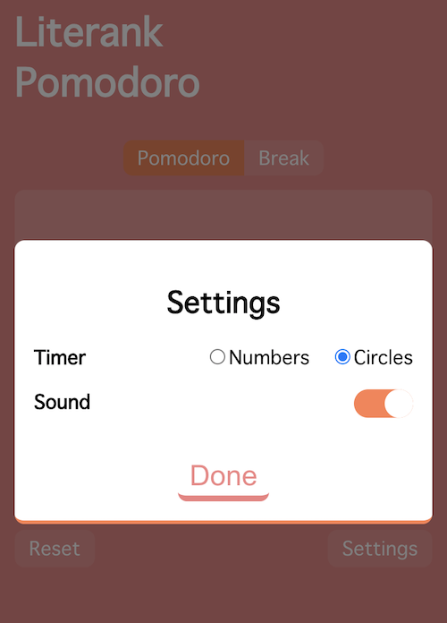
The settings page looks like this: